Cover History

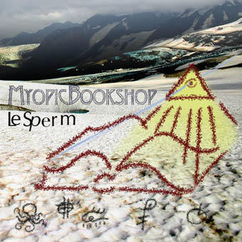
For all of you that were lucky enough to receive my album 'Ockham's Razor' here is a bit of an insight into the cover development. The album was created under the working title of 'Myopic Bookshop'. A title which I grew bored of when the time came to print the album. I plumped for Ockham's Razor instead but don't really like this title now either although I think I made the right decision on the finished cover. Anyway, in the beginning I asked Joe to create something for me as I had liked the stuff he was coming out with for his University and was patently failing in my own attempts. Among others the pictured image was Joe's first attempt. I was really impressed by this attempt from the outset. It looks really professional (in a non-derogatory sense) and was far better than I was expecting. In the end this was what also hindered it. It would have created the wrong impression about the album. That the music inside was full of well produced, well crafted songs and well...... it's not. The album cover was meant to show that this was a bunch of obviously slap-dash experimental songs to be taken seriously, but not too seriously. As Joe said, "I knew what I wanted". Unfotunately I didn't know what I wanted well enough to create it, only what I knew I didn't want. Until the final cover of course. I particularly liked the book/symbols that Joe created it wasn't an obvious mixture with the mountains but it worked.
My sister has just taken receipt of her own 12" iBook so maybe we will see some design efforts forth coming from her soon. Who knows? My next plan is to enter the WiFi community as access is free here at the university. No file sharing though!

0 Comments:
Post a Comment
<< Home